NL EN
Branding / strategy

KINEO centre for education, childcare and sports

Branding and identity for a modern centre for education, childcare and sports in Roelofarendsveen.

arrow icon All projects Branding / strategy

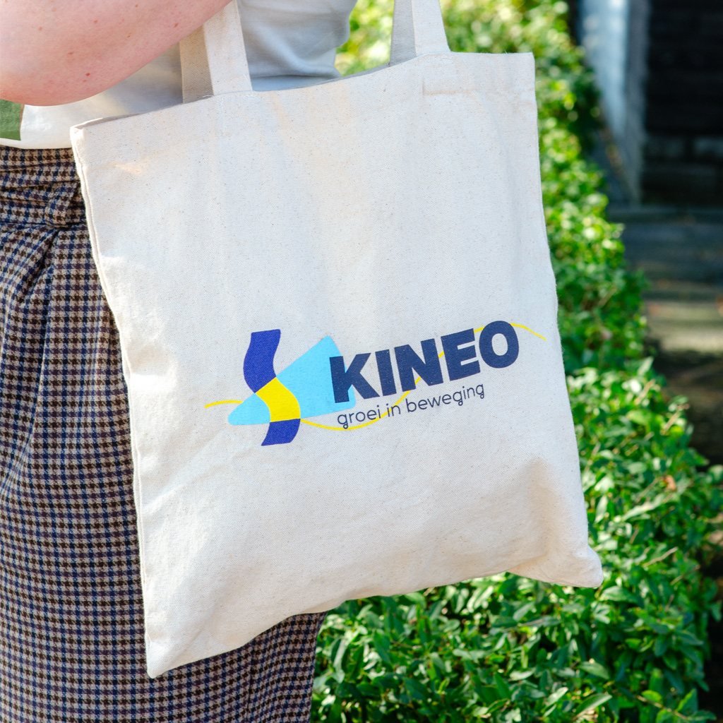
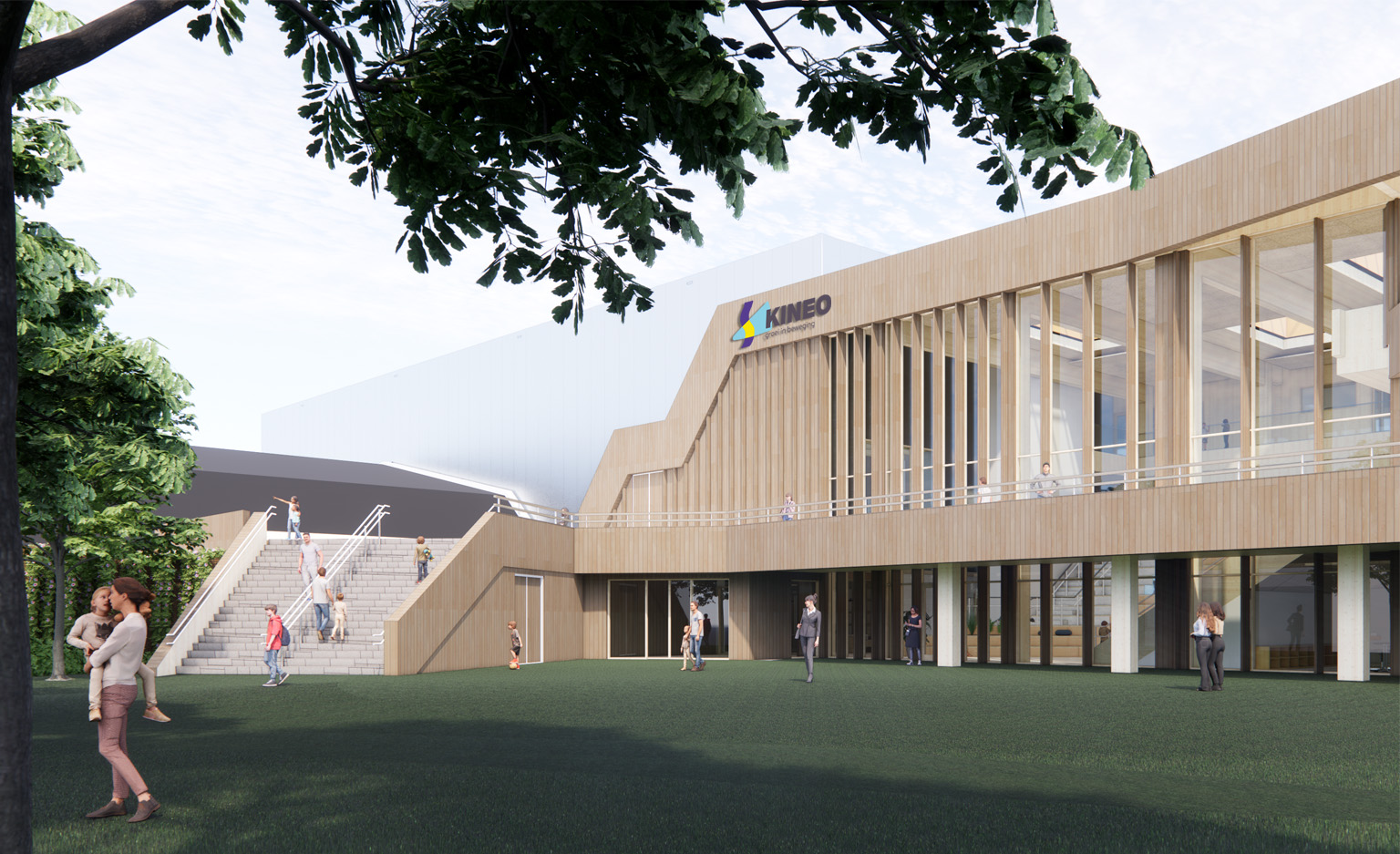
Early 2024, the official starting signal was given for the implementation of a modern and ambitious plan for the KINEO exercise and children’s center in Roelofarendsveen. This involves a sports hall, swimming pool and a children’s center with education and childcare for just over 1,100 children from 0 to 12 years old. We developed the concept, graphic design and execution of a matching branding and visual identity.

Centre for children and exercise

KINEO is a centre for children and exercise (sports) in which seven locations will come together: 3 primary schools, 3 locations for daycare and after-school care and the sports company with a swimming pool and sports hall. The ambition is to create a continuous line between childcare and education. In this, they work as one team with one vision, so that children receive a suitable and broad range of services in collaboration with, among others, sports and childcare. A modern education and care system is being developed for the children. In this, the personal development of the child is central with space to develop at their own pace from a sense of connection. The pillars that have been named here are about playing, discovering, investigating, moving, together, in connection and fitting. Because the building is being developed at the same time as the vision, the building, interior design and vision can reinforce each other. No traditional classrooms are being built, but widely applicable spaces that can connect with what the children need. In addition, topics are discussed such as movement areas, a studio, music room and the outdoor space becomes an extension of the indoor space.

Movement as a starting point

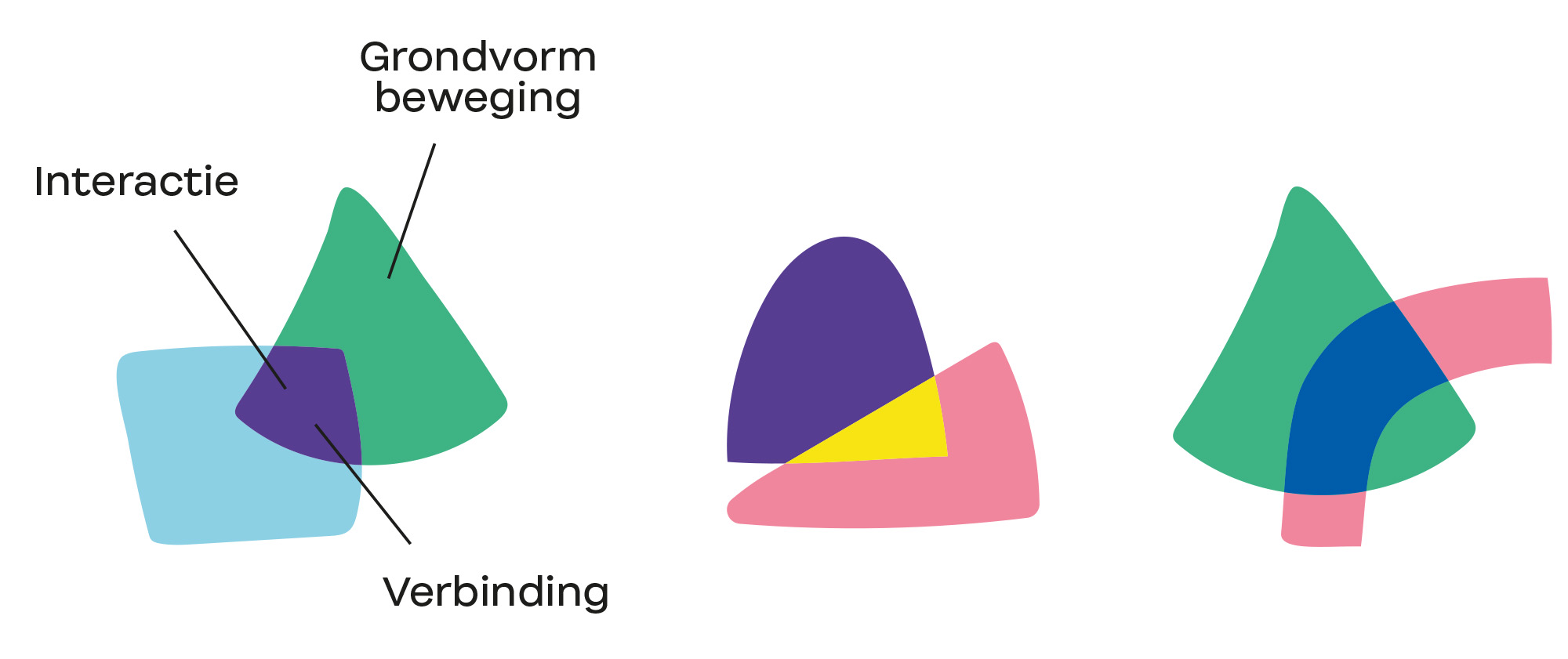
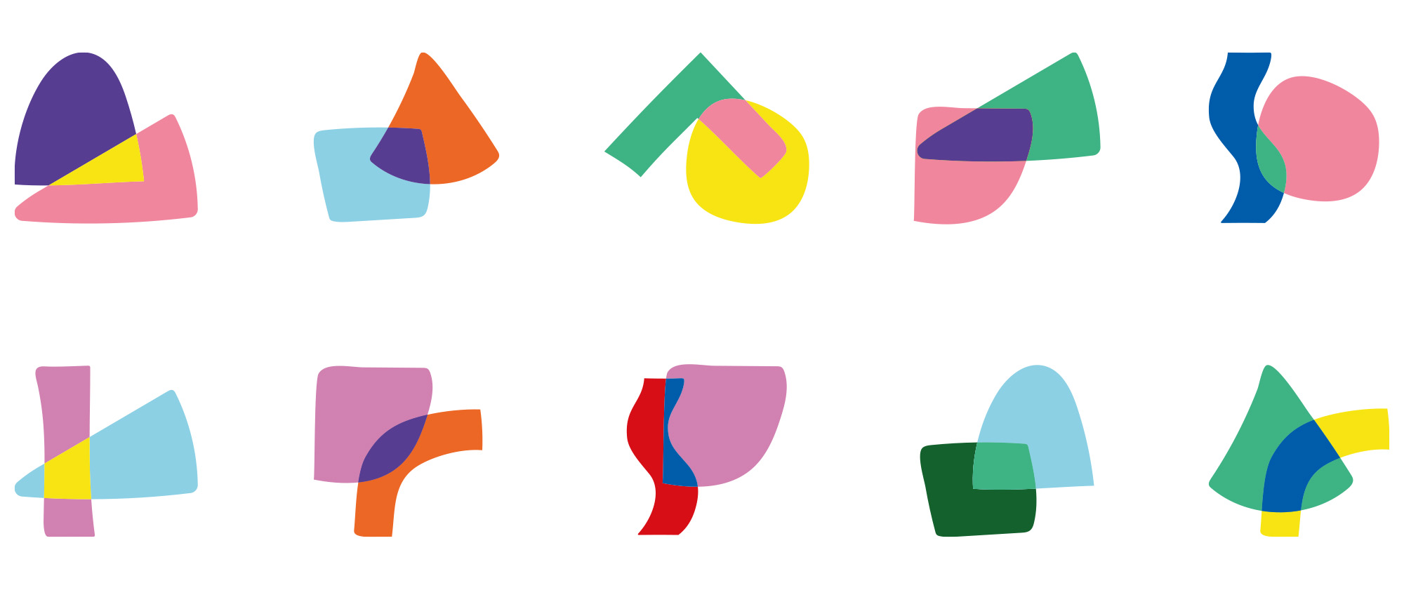
KINEO is the Greek word for movement and therefore movement is not only central to the sports hall and swimming pool, but also to the education and childcare of the children’s centre. That is why we used movement as a starting point for the concept and design. The ASM (Athletic Skills Model) has developed the ‘Wheel of 10!’, a scientifically and practically substantiated model in which all basic forms of movement are included that are jointly important for optimal motor development. The Wheel of 10! is not only reflected in the architecture, but also in the branding of KINEO. We have translated the ten basic forms of movement into a series of 10 graphic shapes and colours. These elements form the playful character. Where the childcare centre and centre for exercise come together in KINEO, interaction and connection take place. Likewise, the graphic shapes also come together visually and interaction and connection also take place here. This ensures an enormously dynamic and positive whole.

Endless combinations

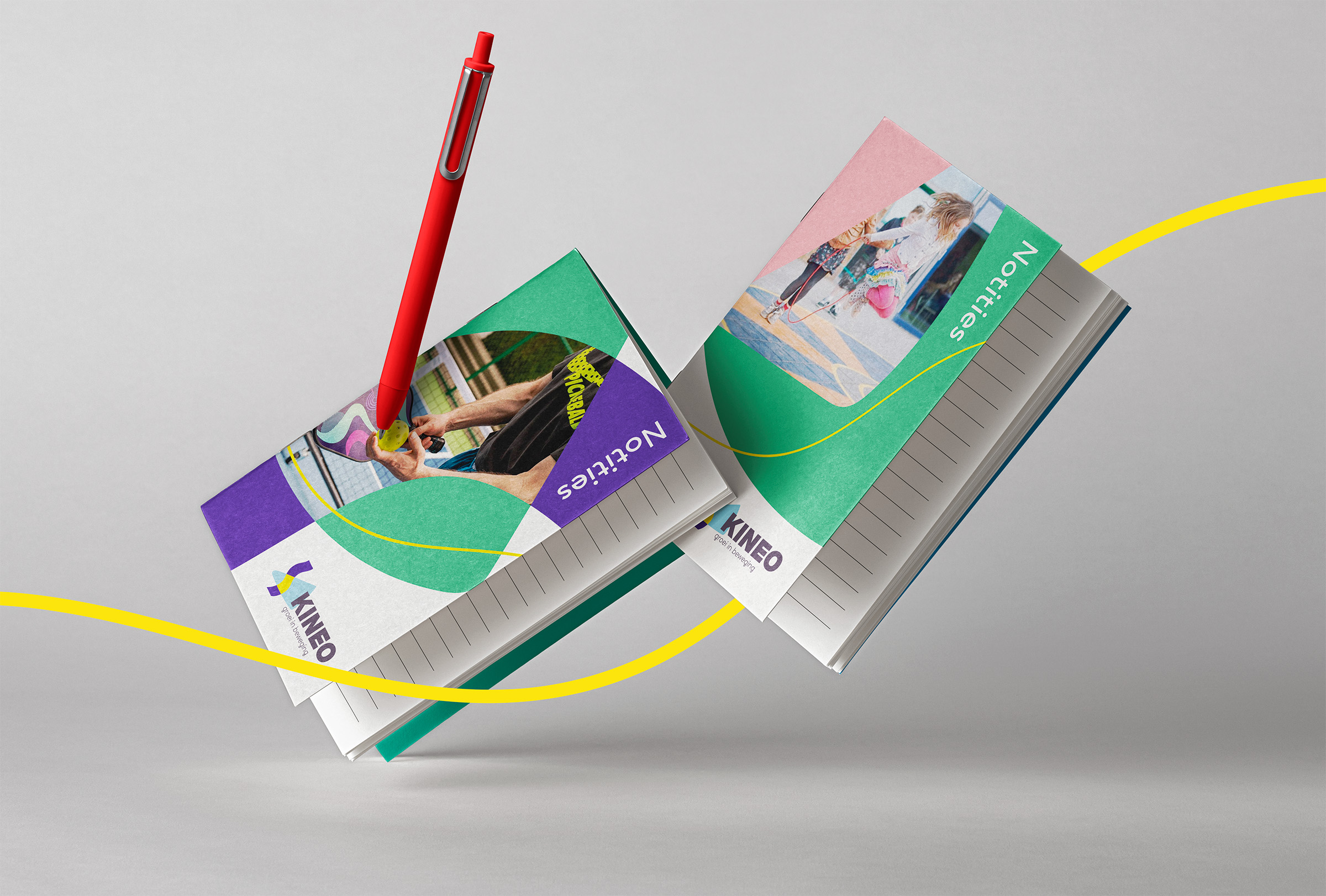
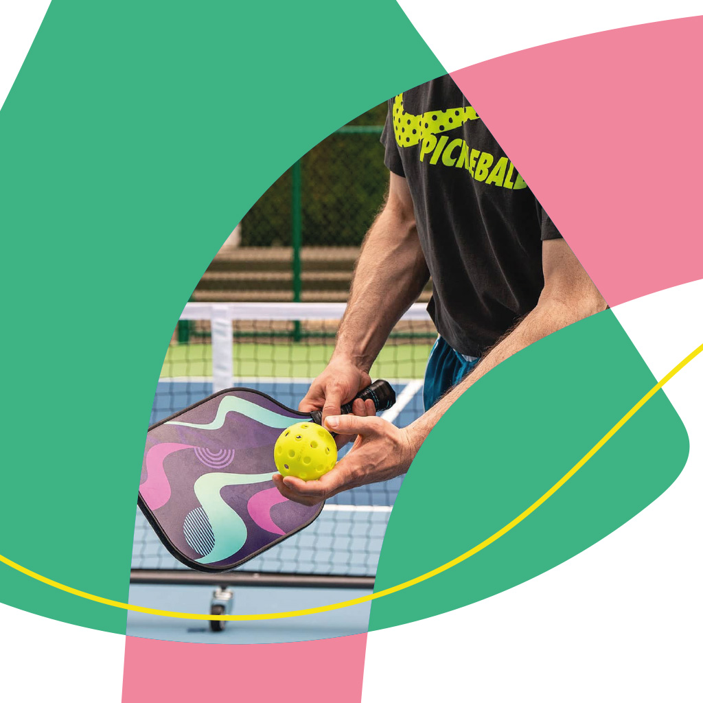
A large palette of shapes requires a large palette of colours. We have chosen fresh and bright colours. This not only brings together the colours of different personalities (who also physically come together in the centre), but also allows the different combinations to be applied in various situations and used for a wide target group. The colours are a fresh connection to the earthy colours that will be applied in the building. An additional design element in various materials is the yellow energy line. This stands for continuous growth, movement and your own route. There are many ways to play with colour, shape and interaction.

Growth in motion

Just like the pay-off of KINEO (‘growth in motion’), the corporate identity and branding of KINEO is also growing and in motion in the coming period. During the large-scale construction and development of KINEO, we are working on information booklets, construction signs, lettering in the building, the website and more.

Next project

UX/UI Design

Brew Monk™

Interface design for all-in-one brewsystem Brew Monk™.

arrow icon All projects UX/UI Design